


Textspace 1
[2021]︎︎︎ Digital media, Font-making, Inscription, Translation
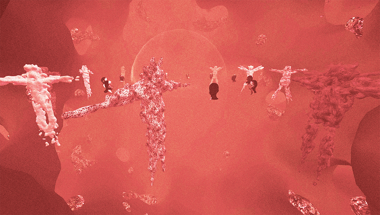
Textspace is an exploration of the nature of semantic dimension overlaid upon the form and materiality of inscription, and their relation to each other. Writing basically is a markmaking
exercise where each mark, is associated and linked with a particular sound and each word with a signifier of a particular specific meaning, forming a language, based upon certain
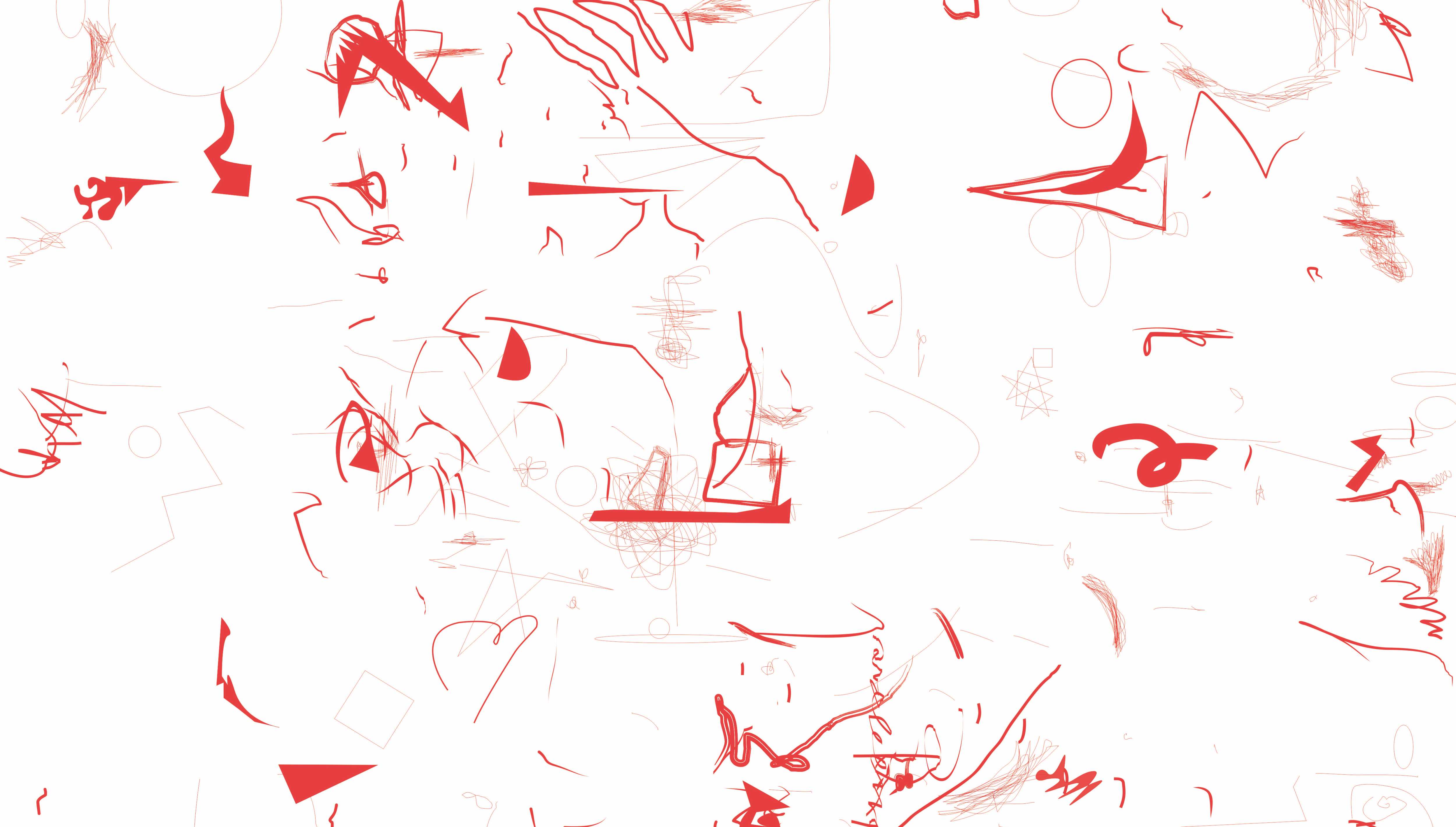
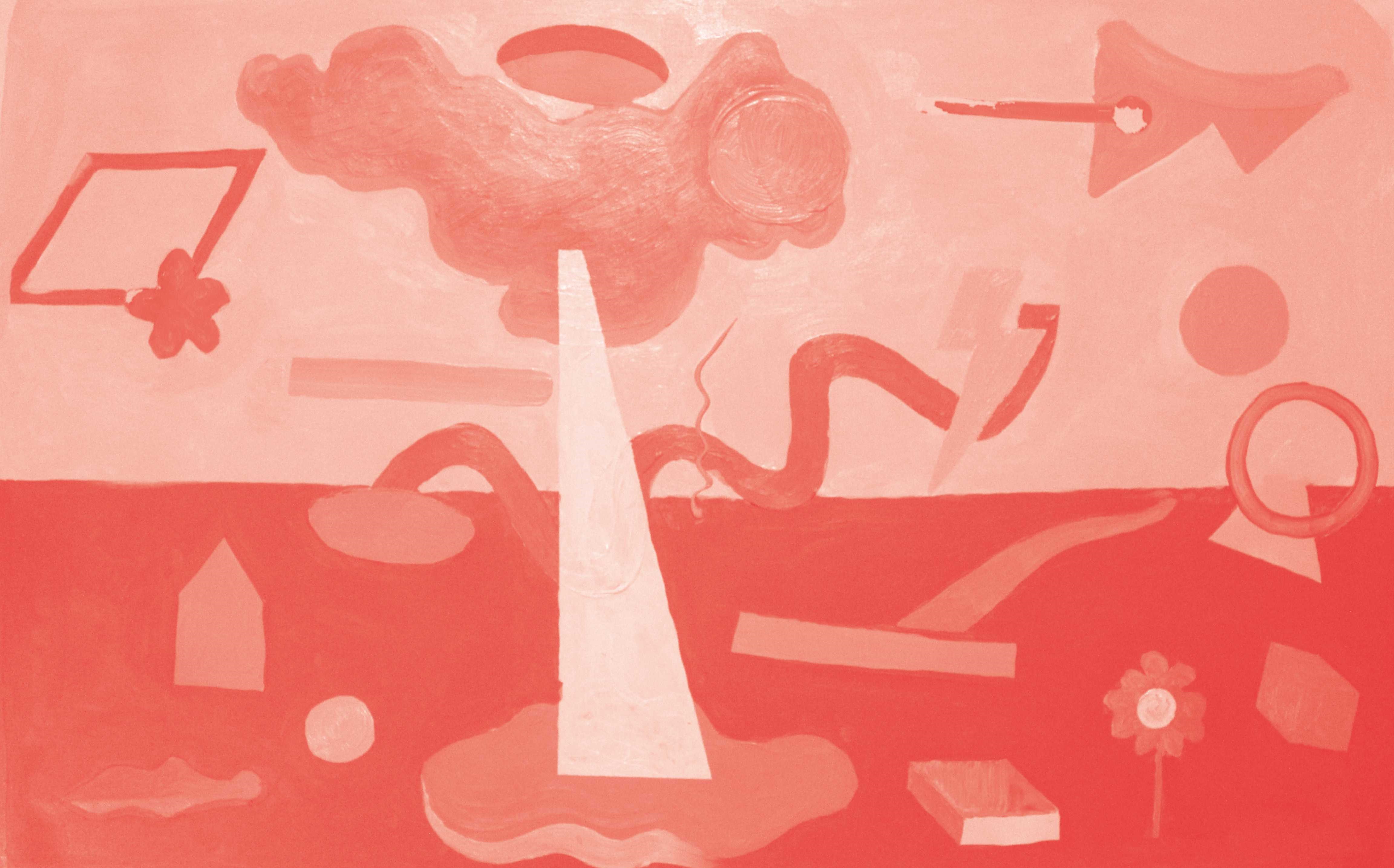
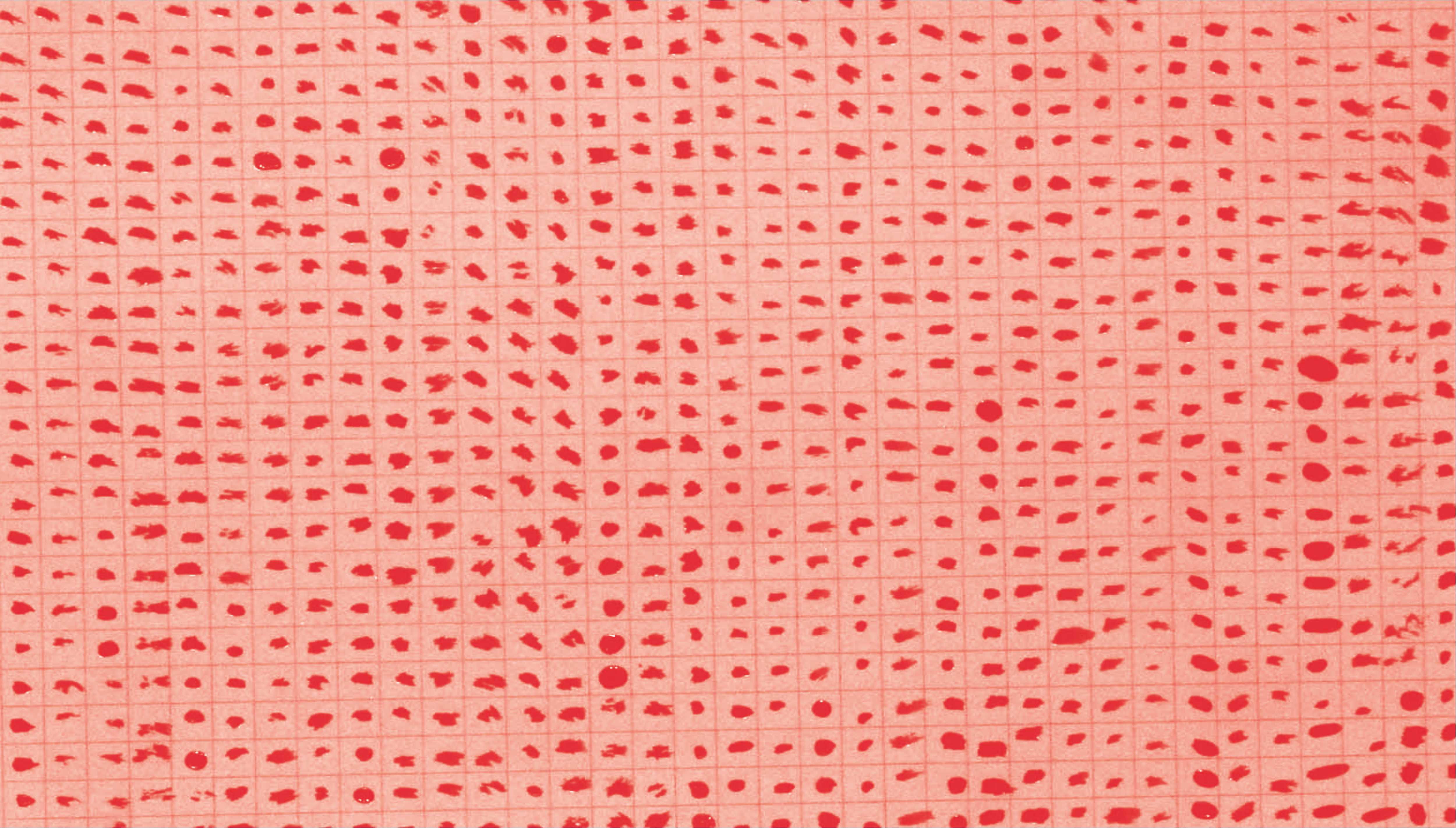
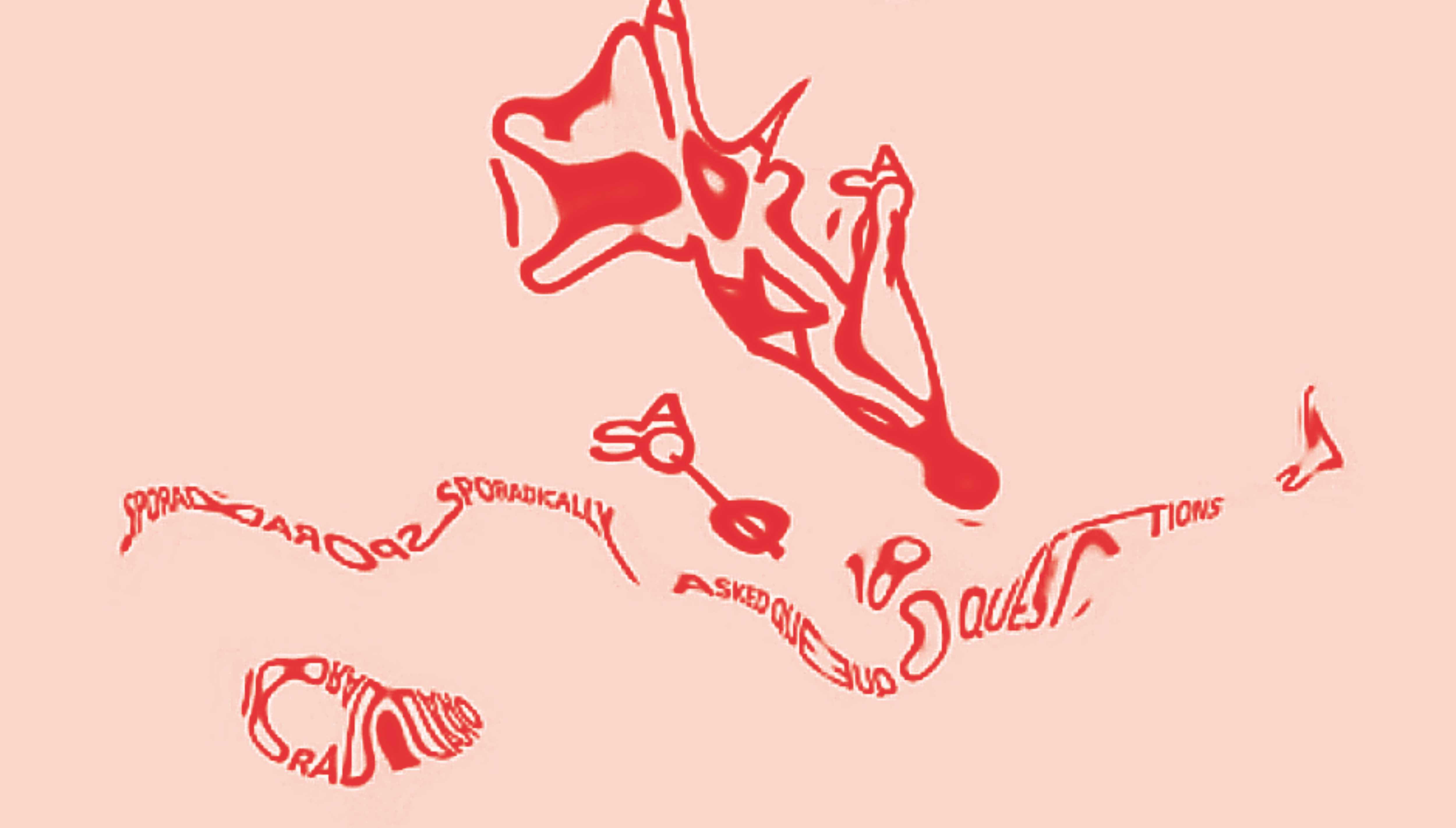
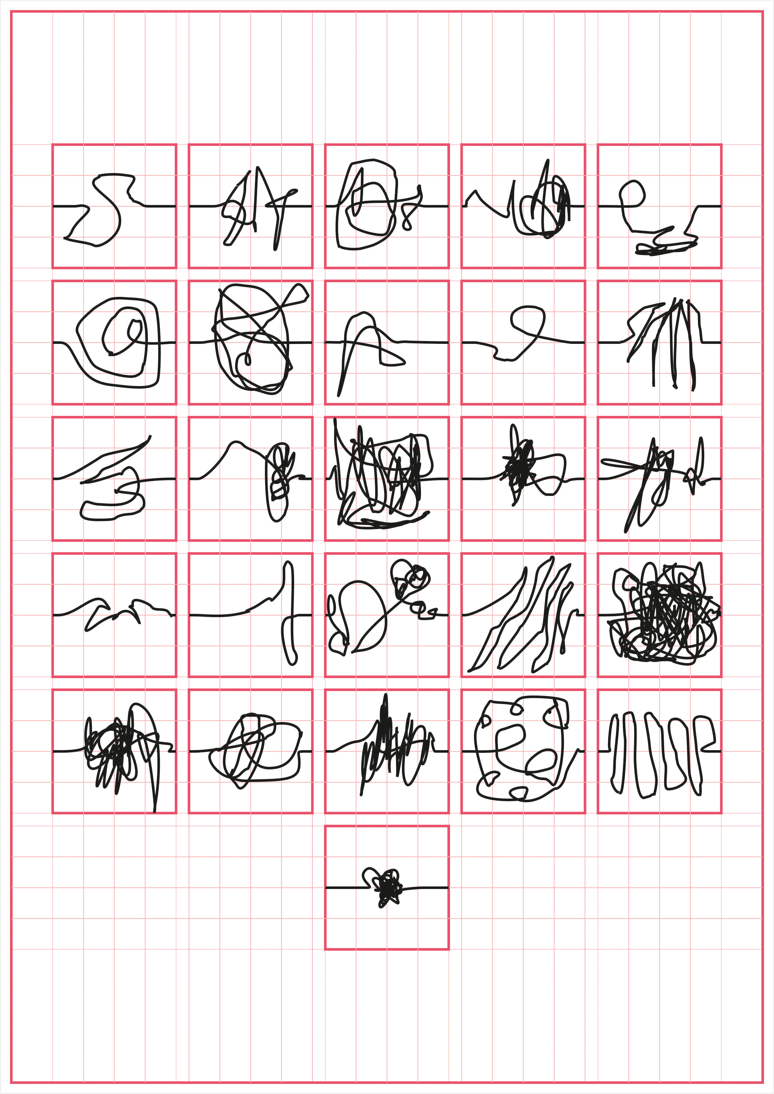
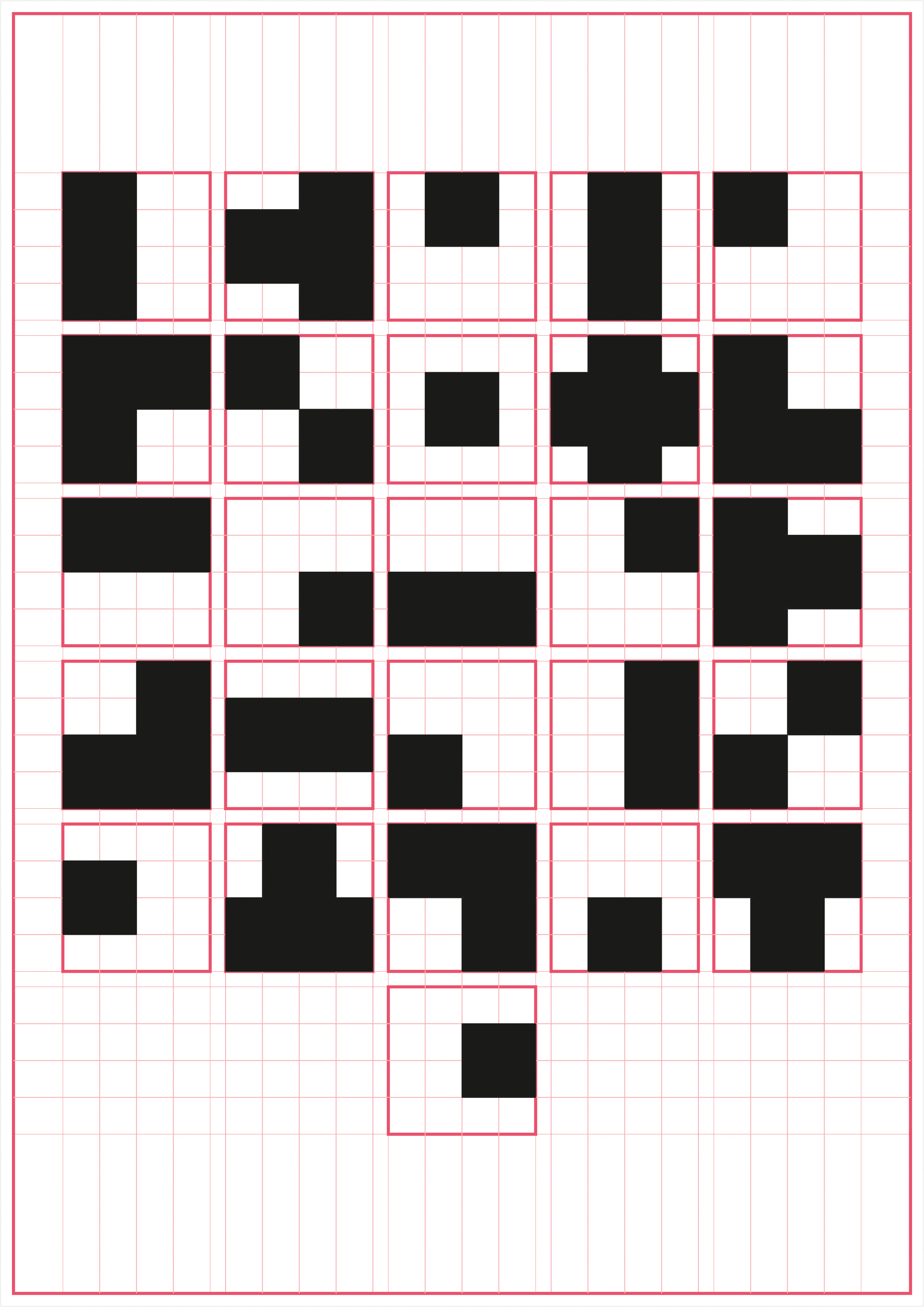
rules which an individual or a entire community conditions itself with, over generations. A language is always a ´language of someone’, and its existence is linked the Subject that is using it, a reader that gives meaning to what would be otherwise an arbitrary shape or a form. What if a new form was given to the inscriptions, in a way that the newly designed unique alphabets do not resemble the familiar shapes of albhabets they are associated with at all? The text would be stripped from its readabilty and meaning. It would be consumed only in its formal sense, where the hold of signification and familiarity over text disappears, making it an agglomeration of weird / random forms with no readability, as if merely an abstract painting. But it wont be random since each text would produce a unique form, somewhat like a QR code, which could be easily read by a machine, as the machine, unlike humans, has the capacity to integrate a new signification system within its vision instantaneously. For the machine, everything is an image and everything is a language.
rules which an individual or a entire community conditions itself with, over generations. A language is always a ´language of someone’, and its existence is linked the Subject that is using it, a reader that gives meaning to what would be otherwise an arbitrary shape or a form. What if a new form was given to the inscriptions, in a way that the newly designed unique alphabets do not resemble the familiar shapes of albhabets they are associated with at all? The text would be stripped from its readabilty and meaning. It would be consumed only in its formal sense, where the hold of signification and familiarity over text disappears, making it an agglomeration of weird / random forms with no readability, as if merely an abstract painting. But it wont be random since each text would produce a unique form, somewhat like a QR code, which could be easily read by a machine, as the machine, unlike humans, has the capacity to integrate a new signification system within its vision instantaneously. For the machine, everything is an image and everything is a language.
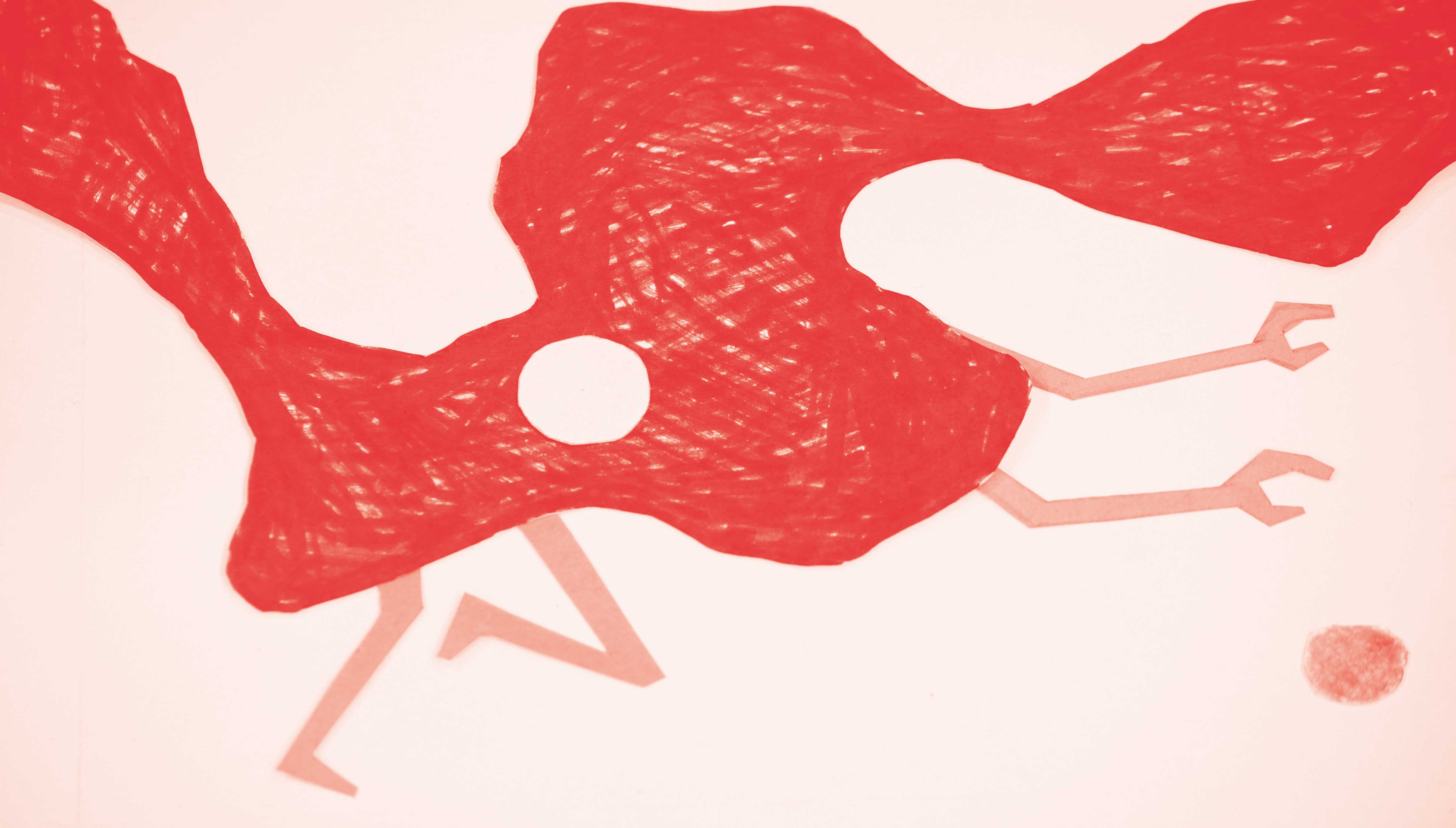
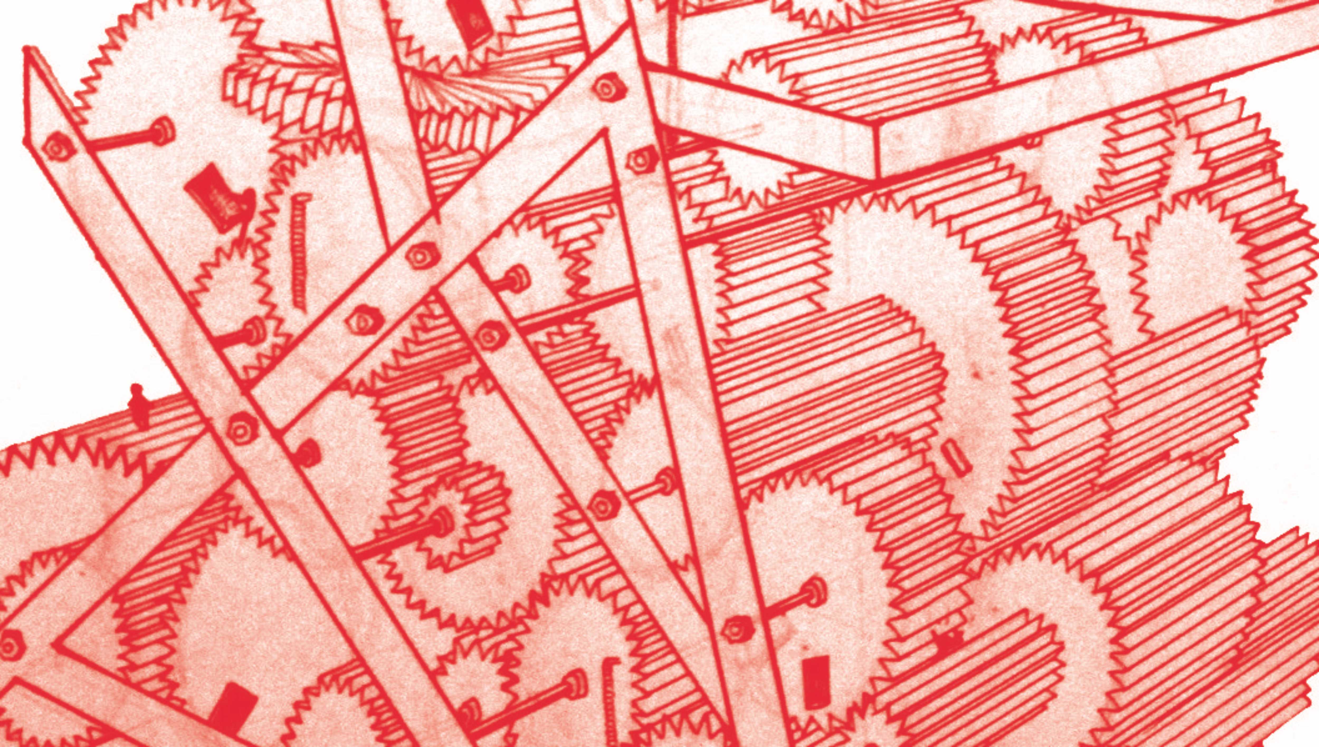
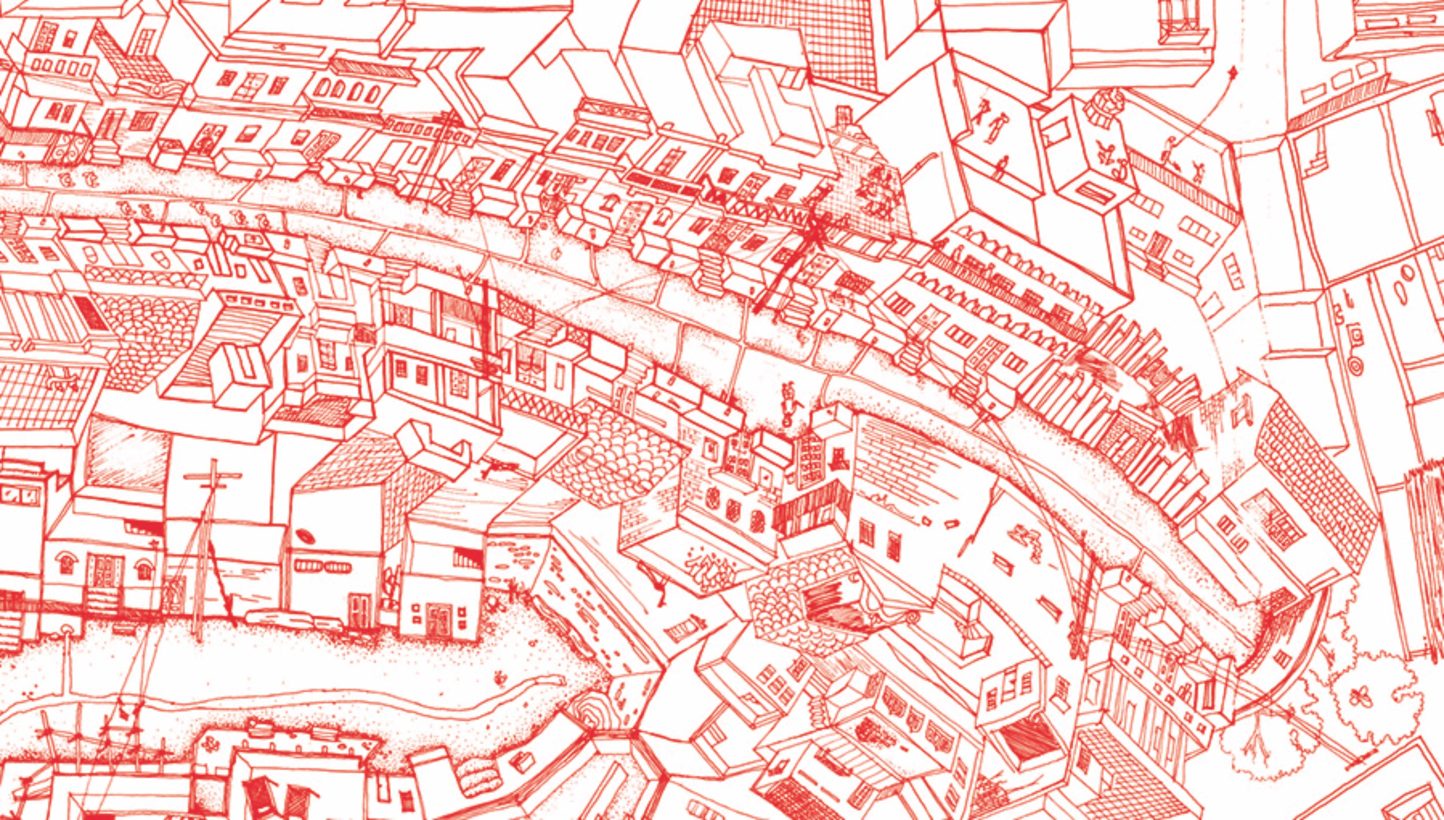
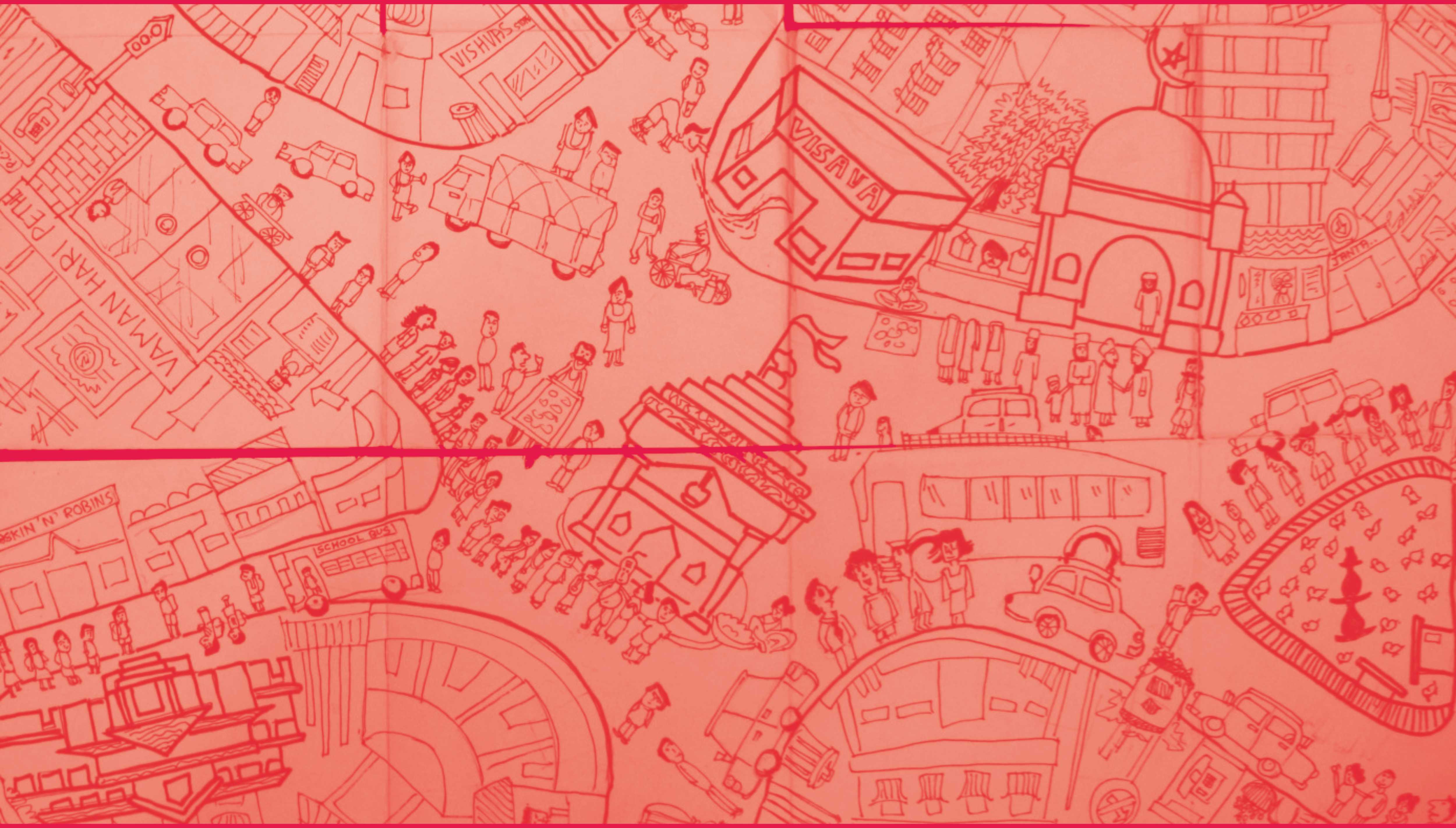
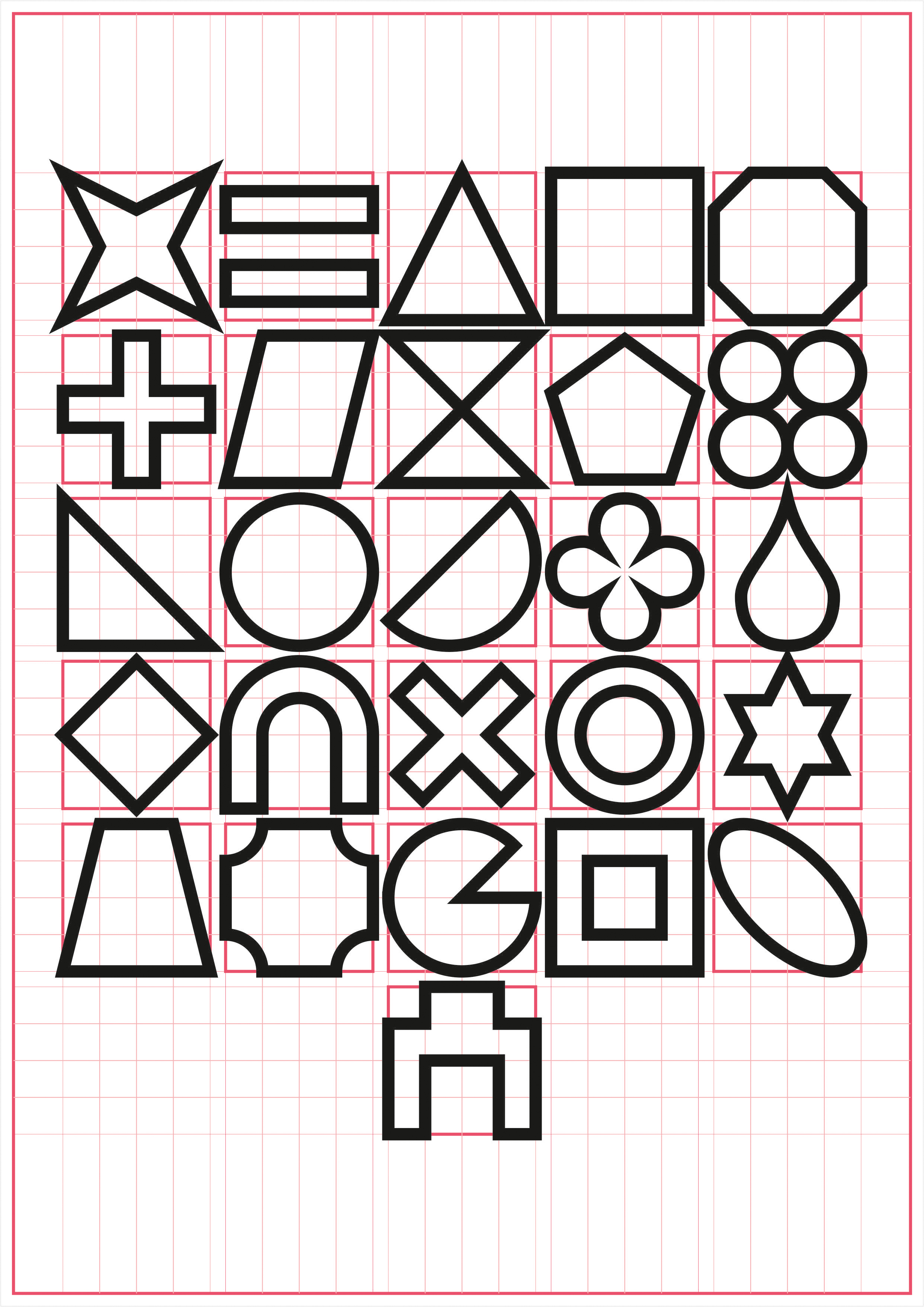
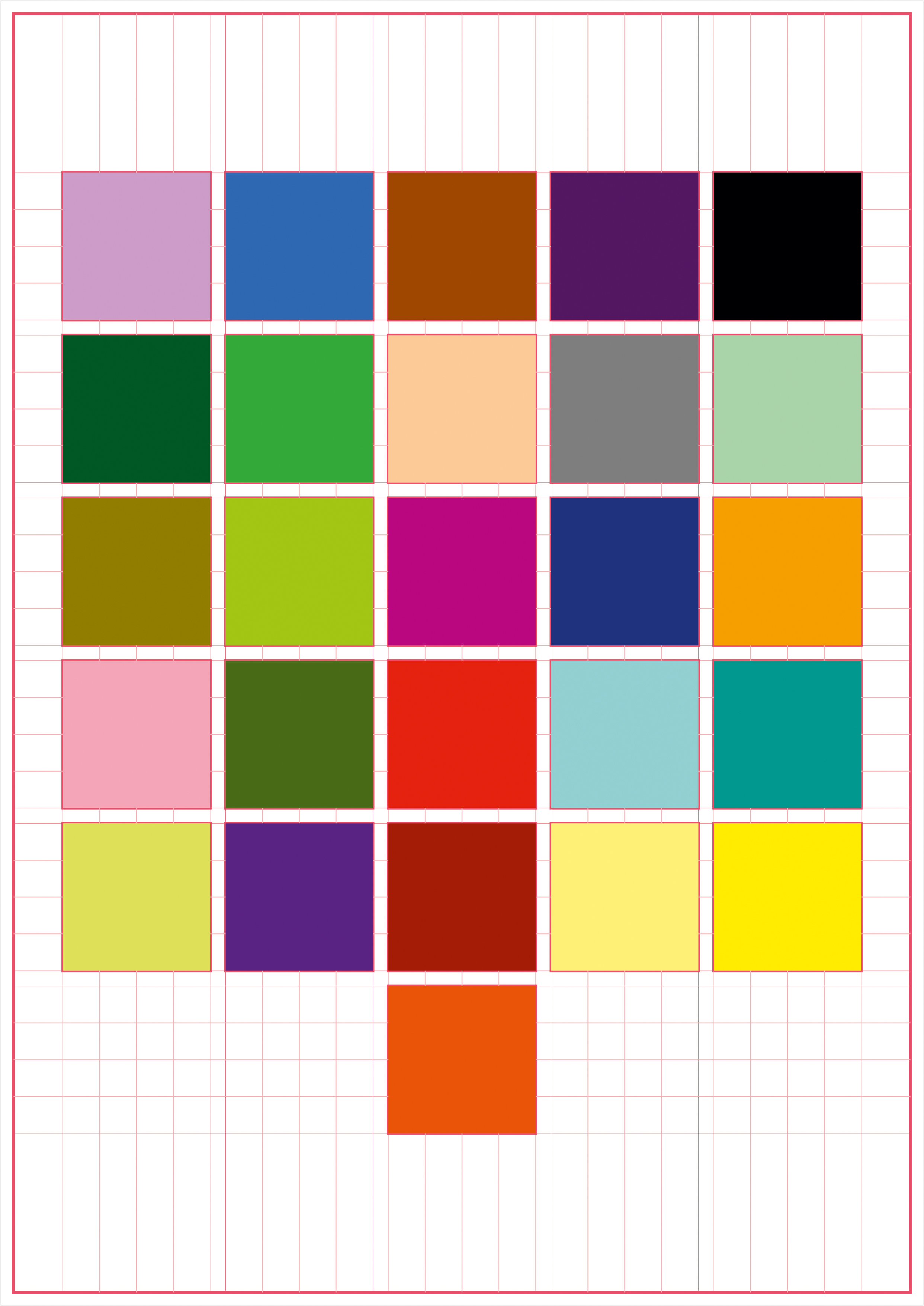
Is there a reason why any of the alphabets are shaped the way they are?What if fonts were designed in a way that they do not resemble the familiar albhabets at all? What happens when text is stripped from its readabilty. What happens when text is consumed only in its formal sense.
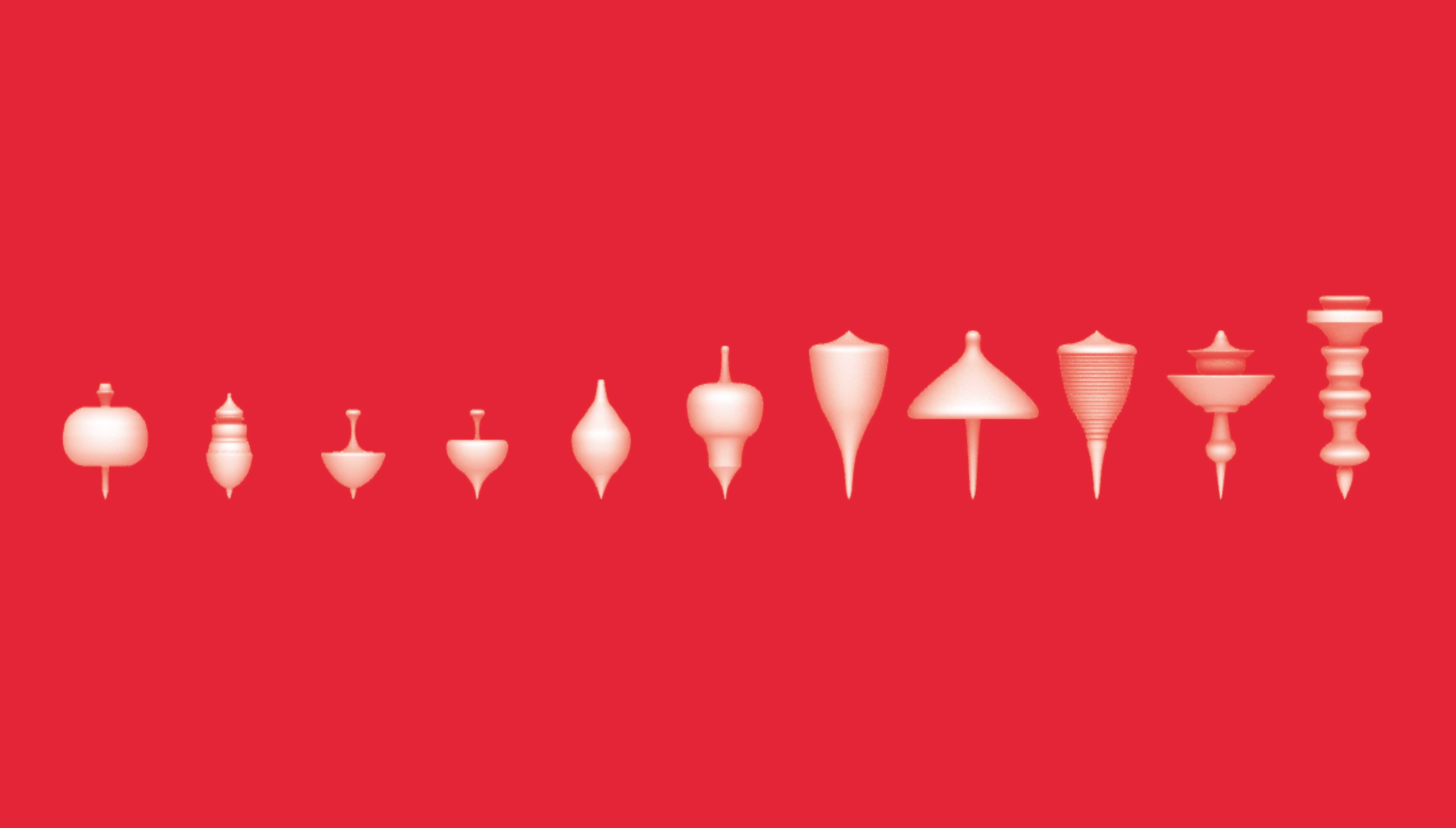
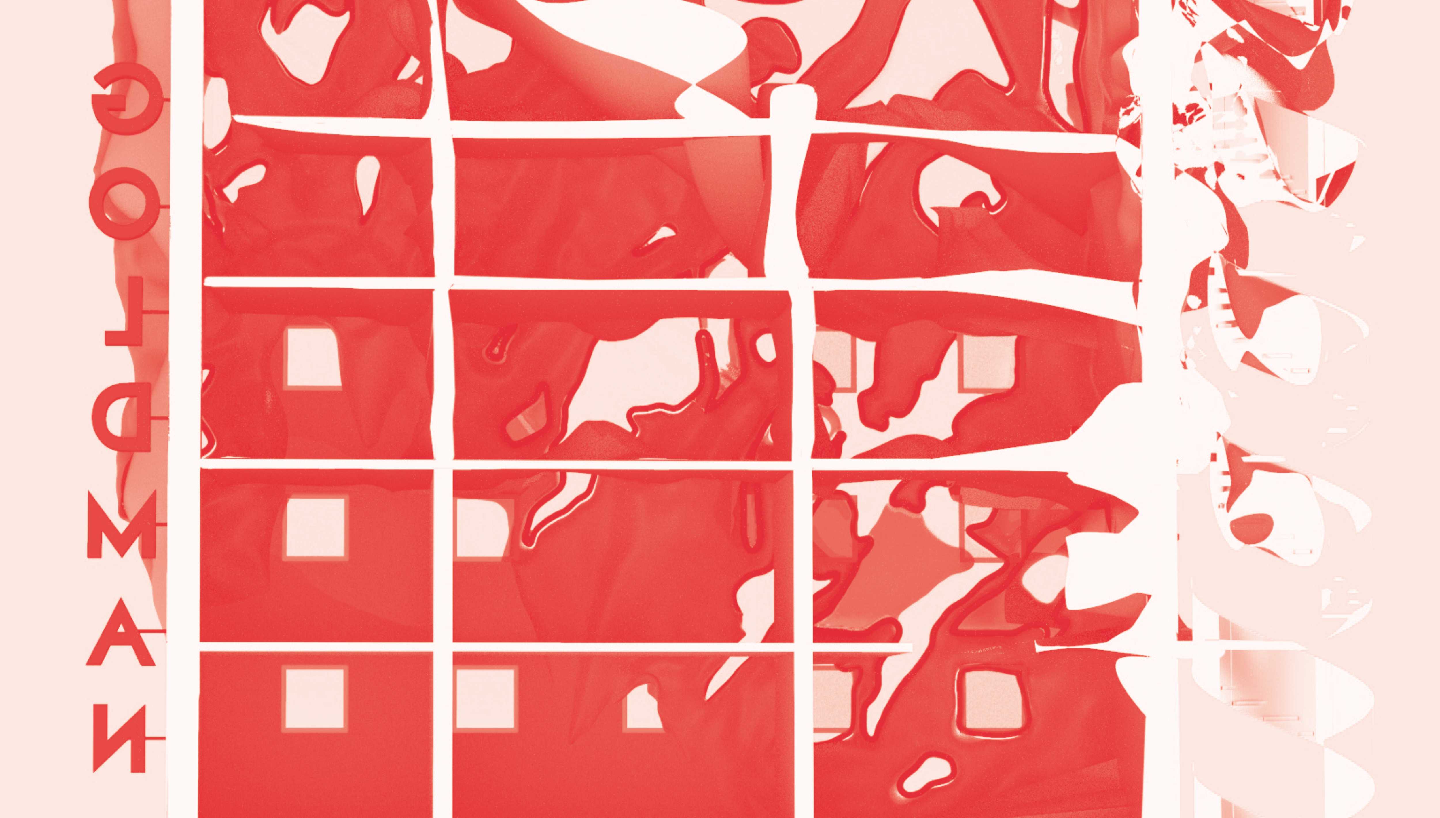
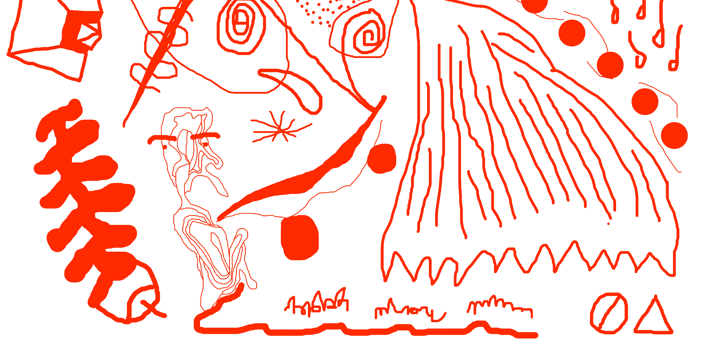
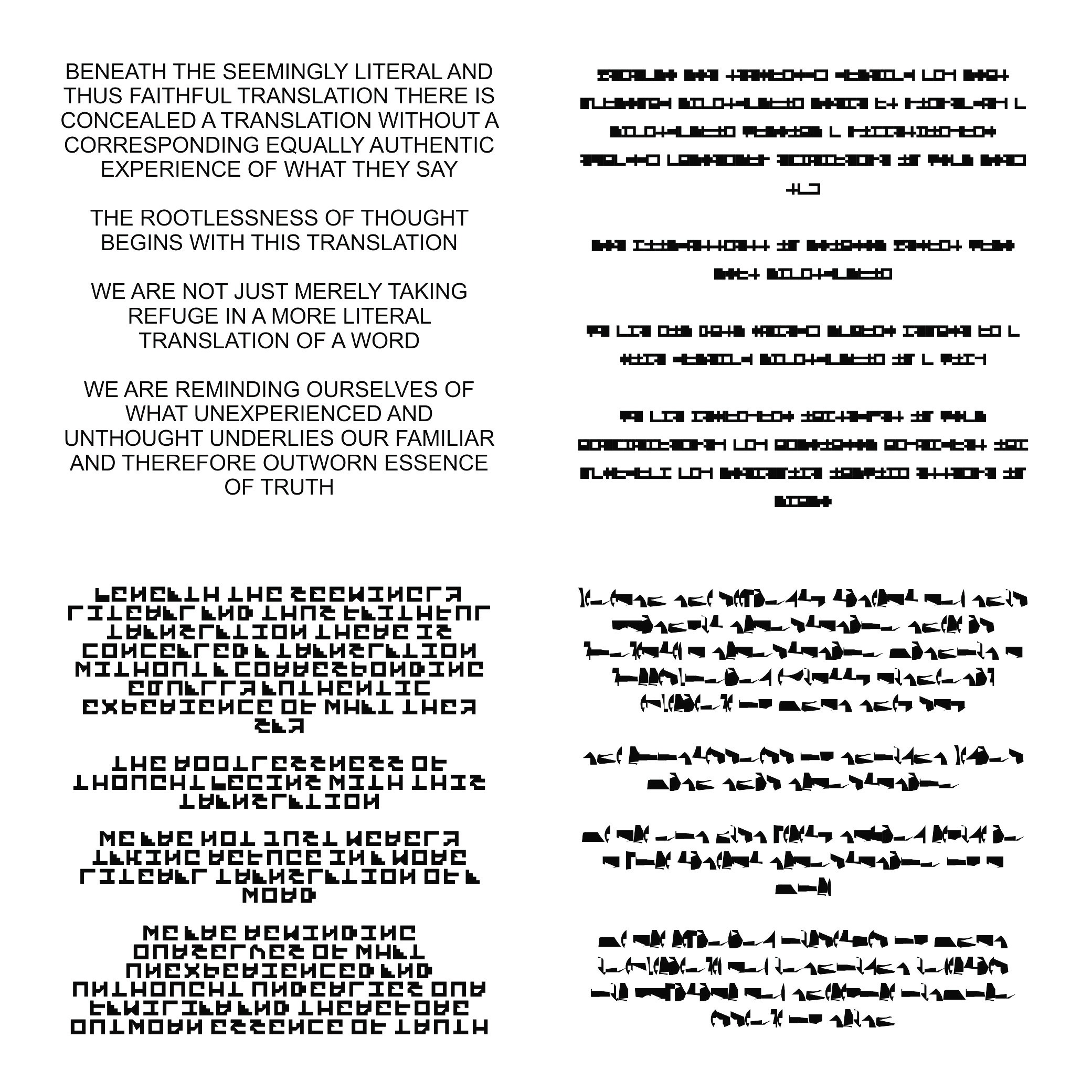
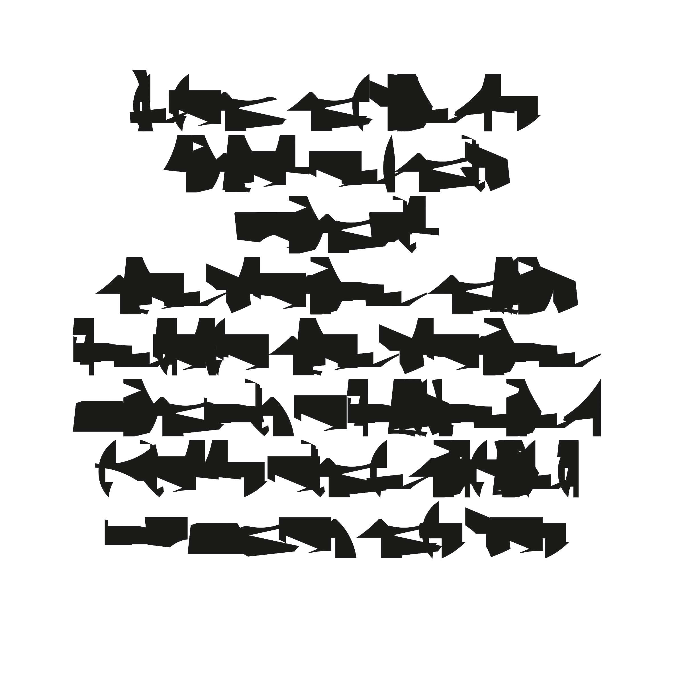
New Arbitrary forms designed for the alphabets and used for font making to create new possible ways of inscription:
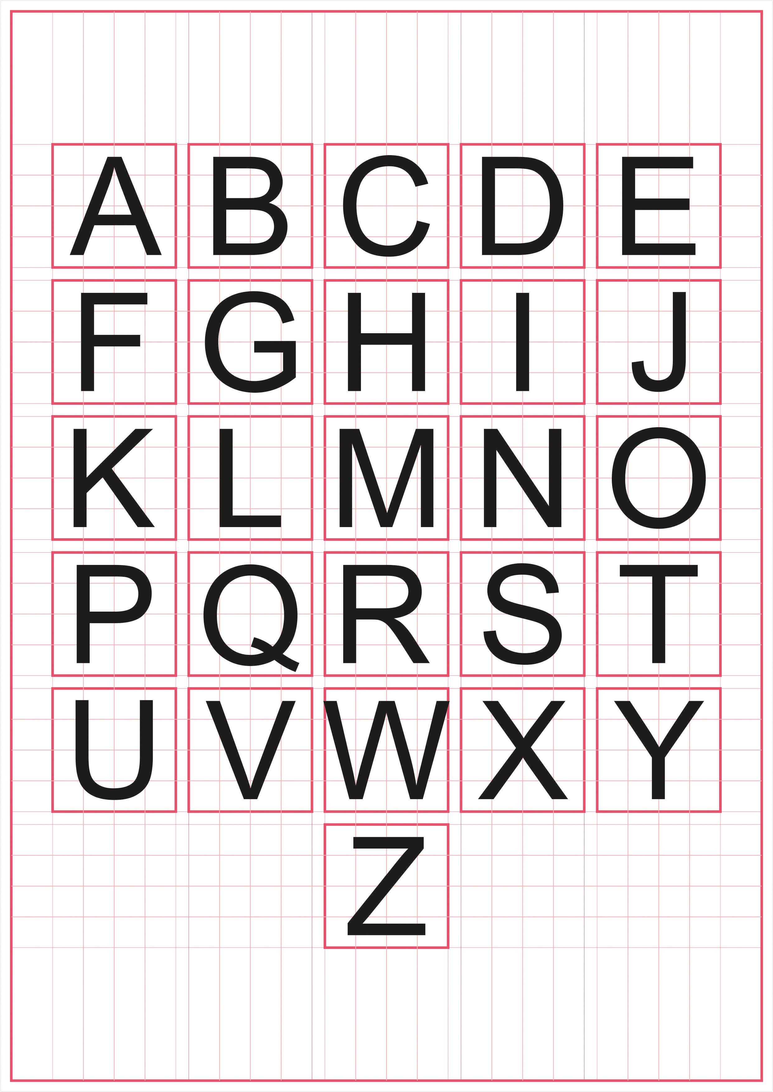

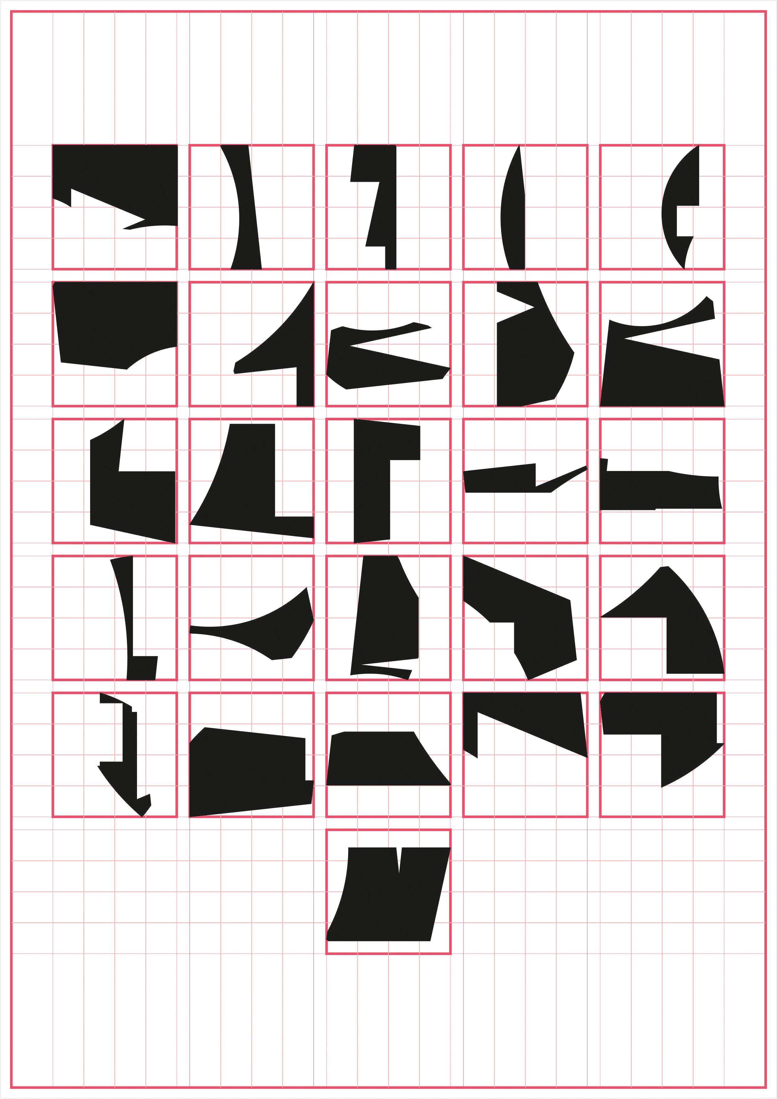

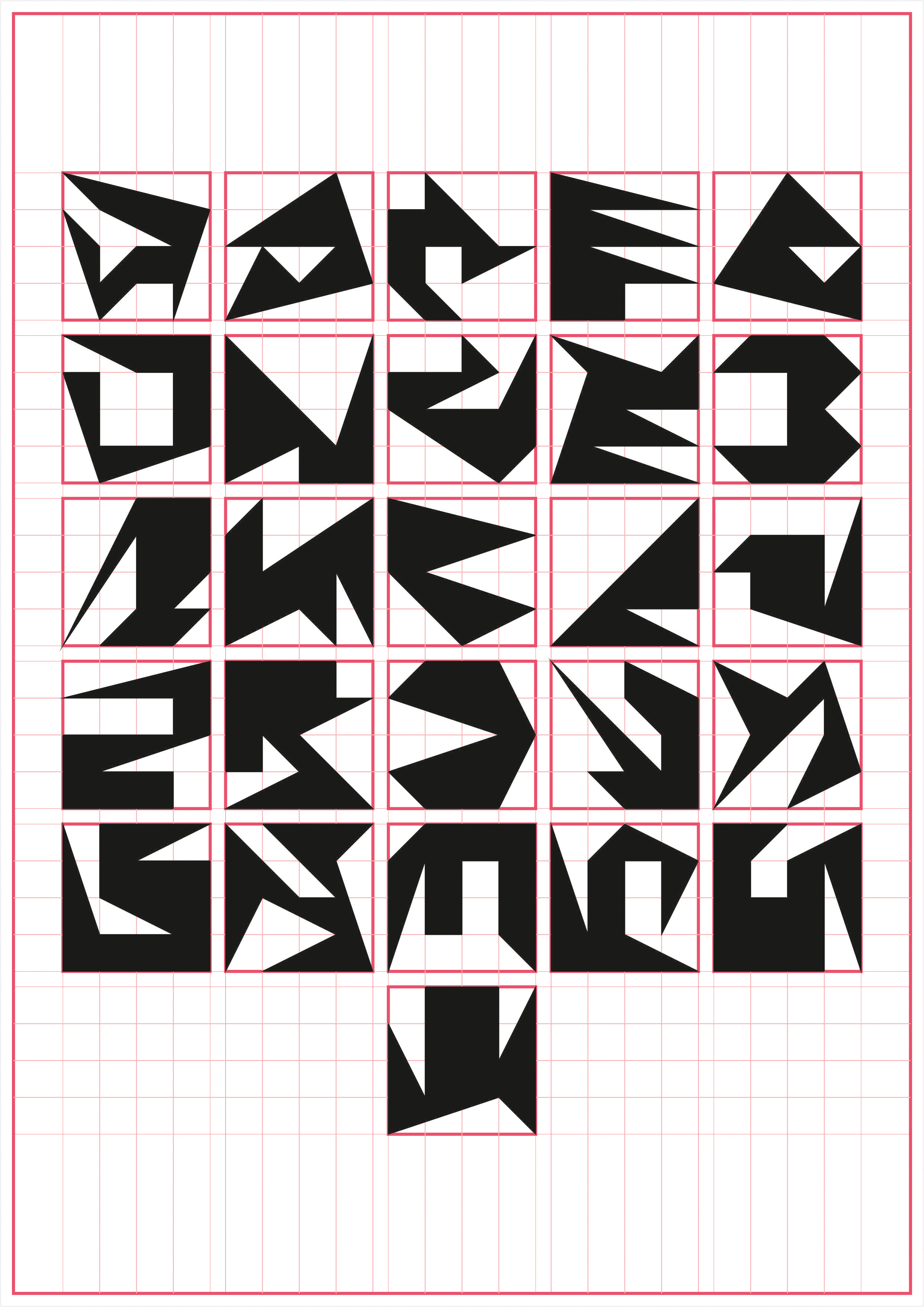
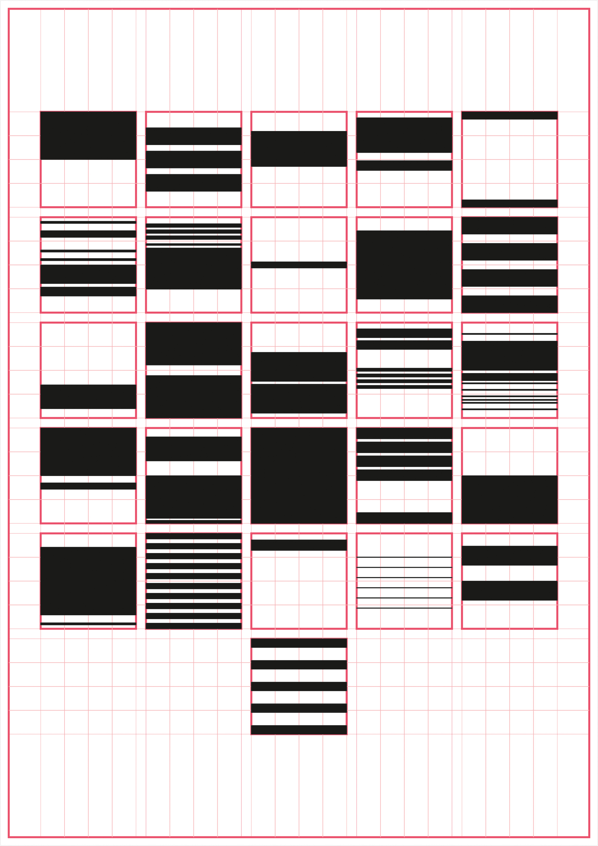
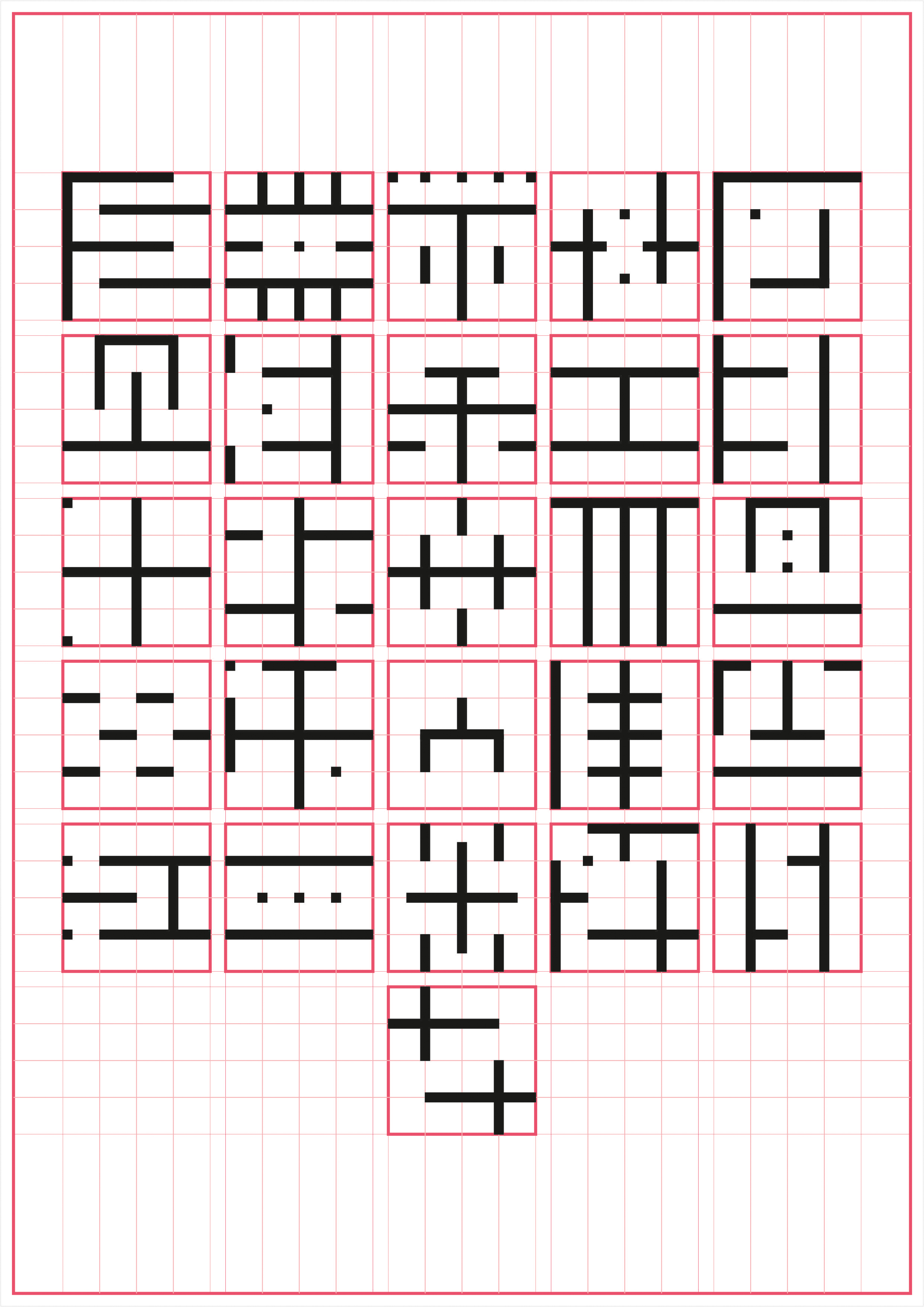
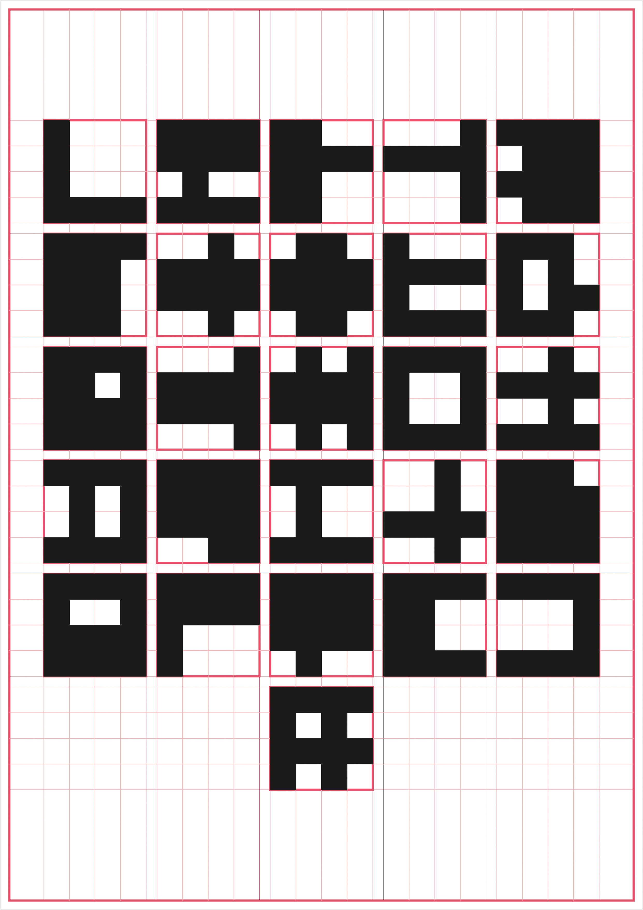
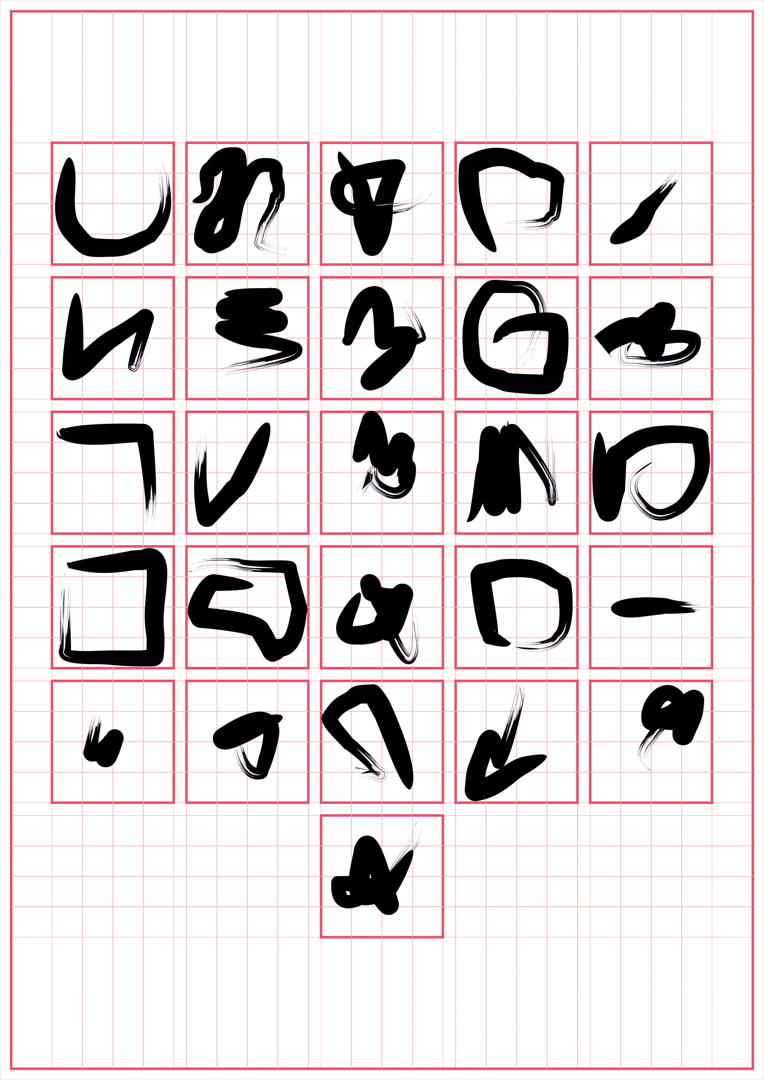
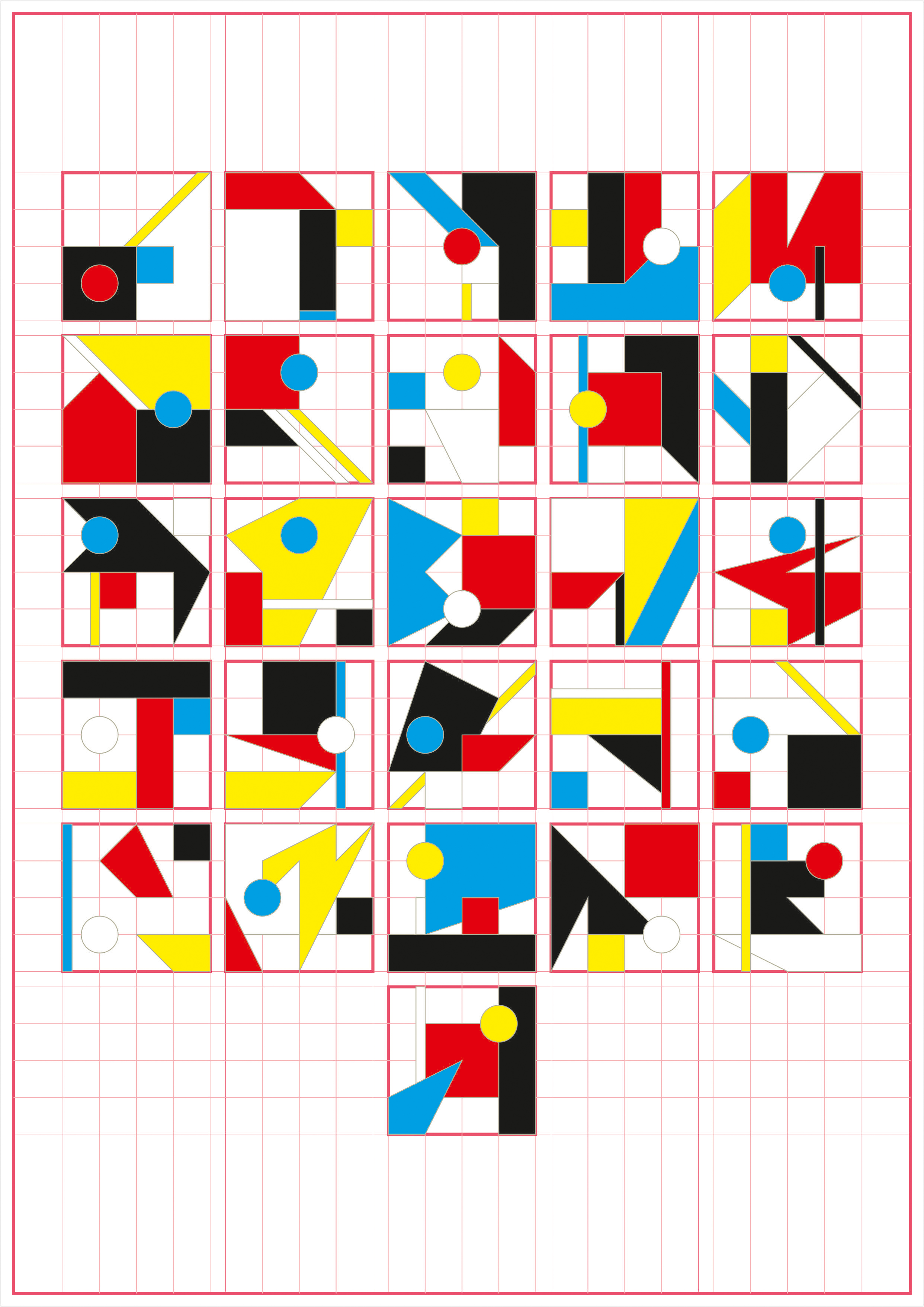
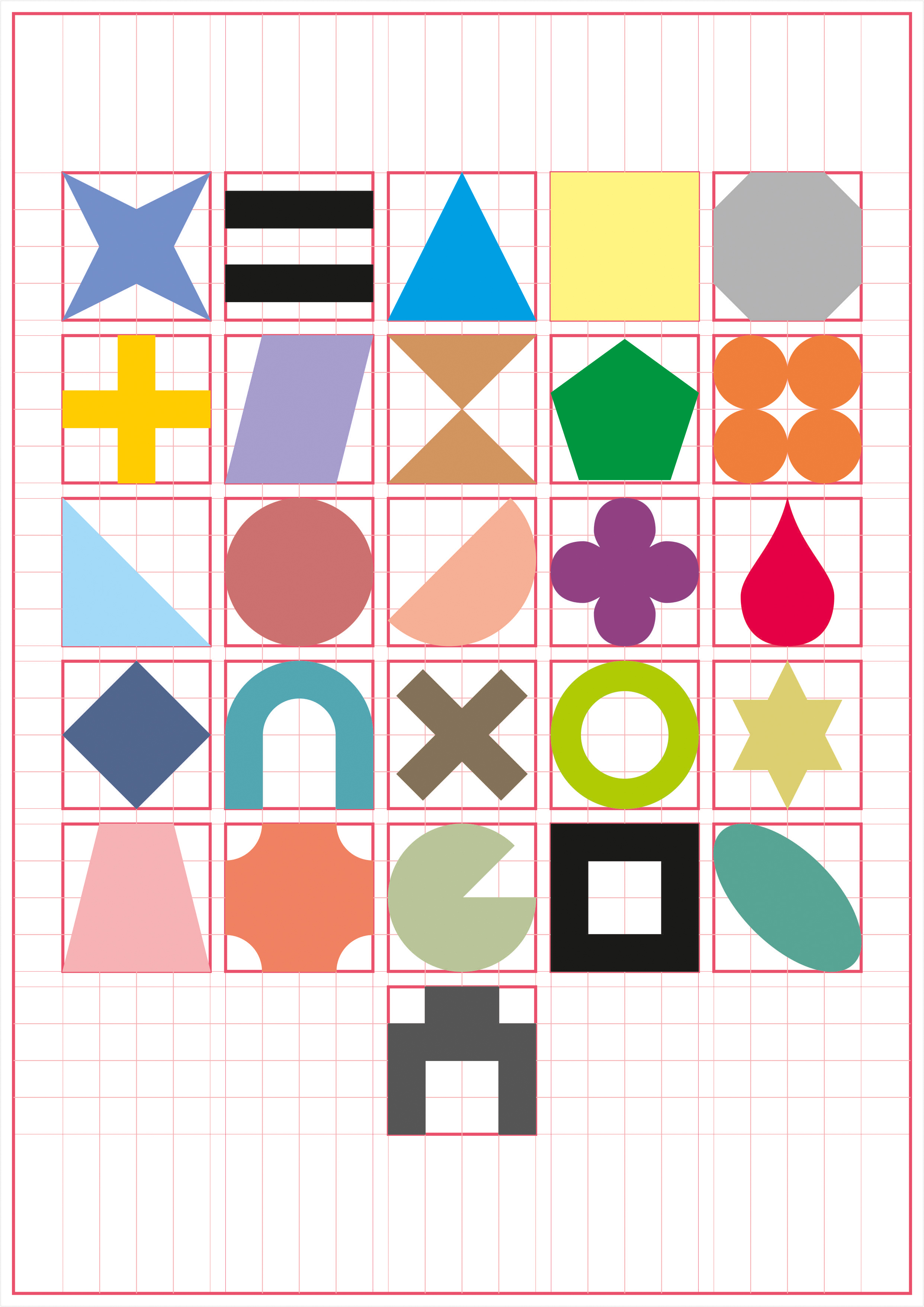
Derrida’s words quoting Heideggar on nature of translation were then used as a sample text which was typed using newly designed fonts to generate new unique patterns and give following results:
Every discourse has a space of itself, all text is thus spatial and not just discursive, in a literal sense!
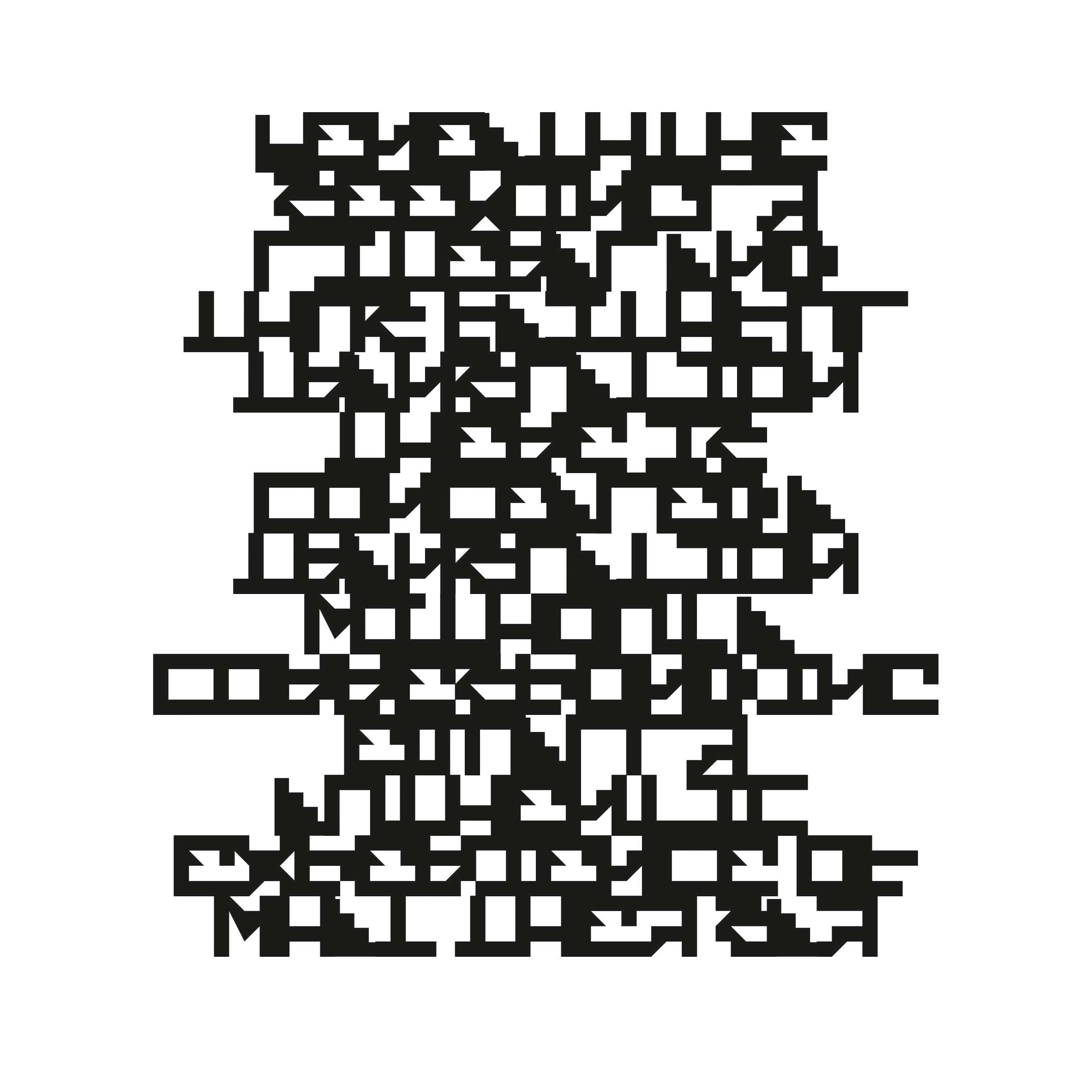
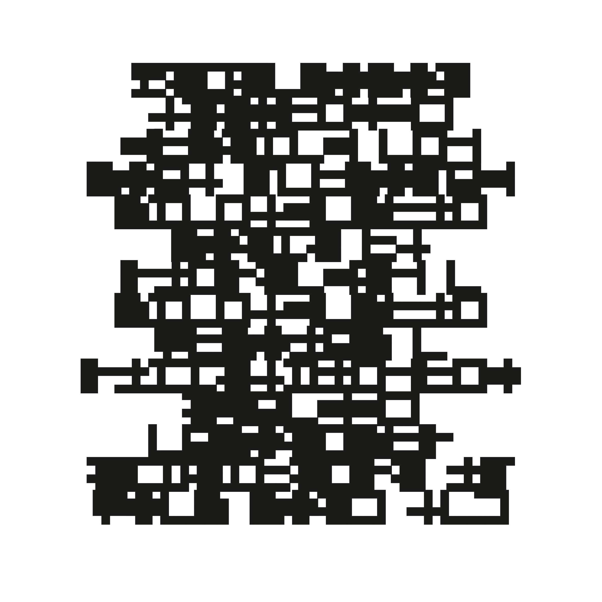
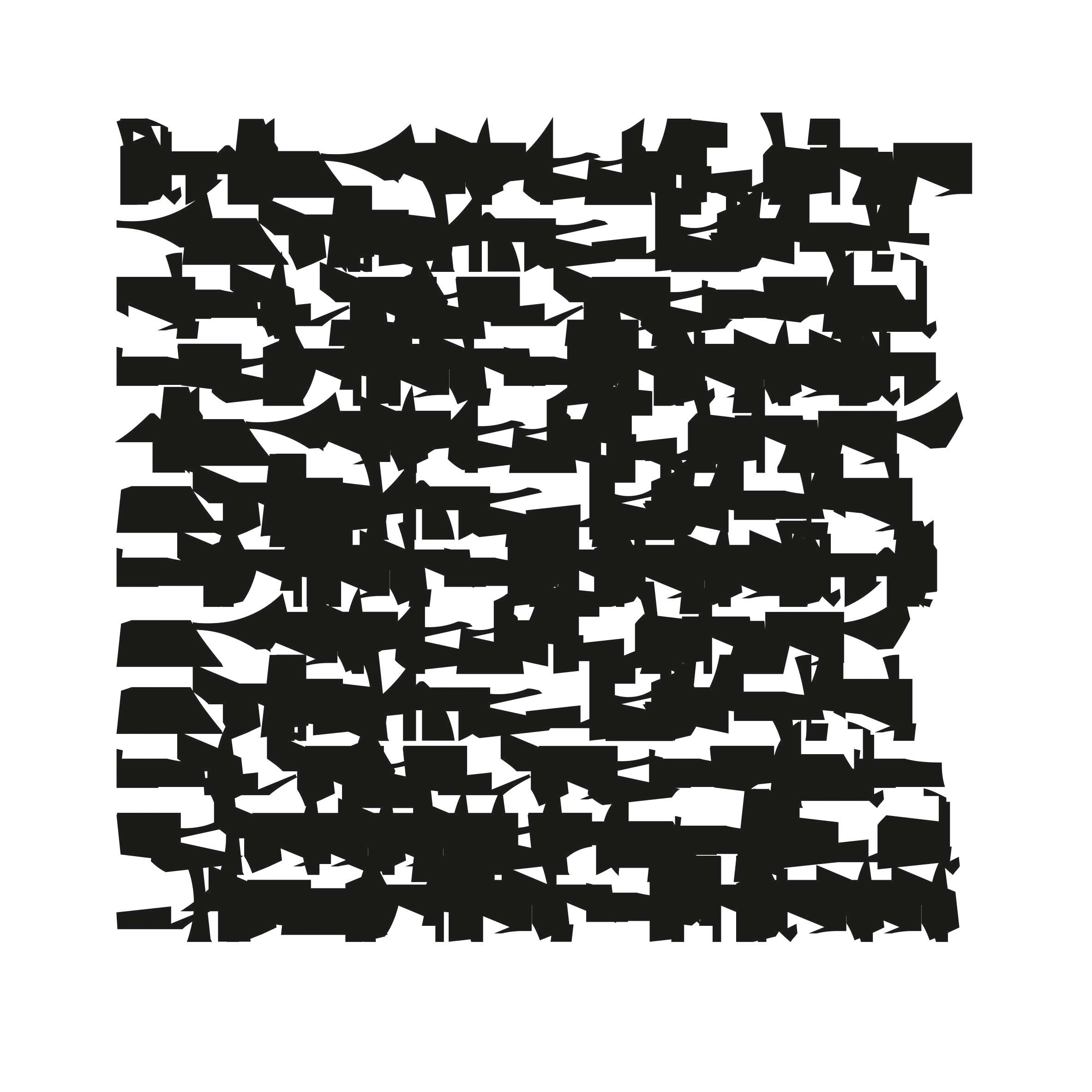
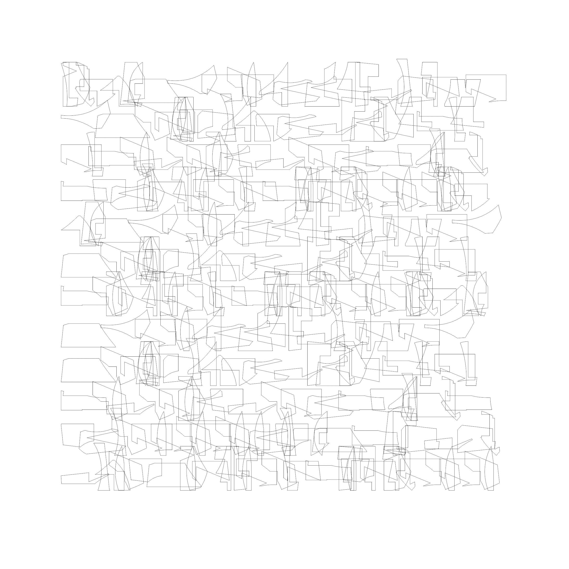
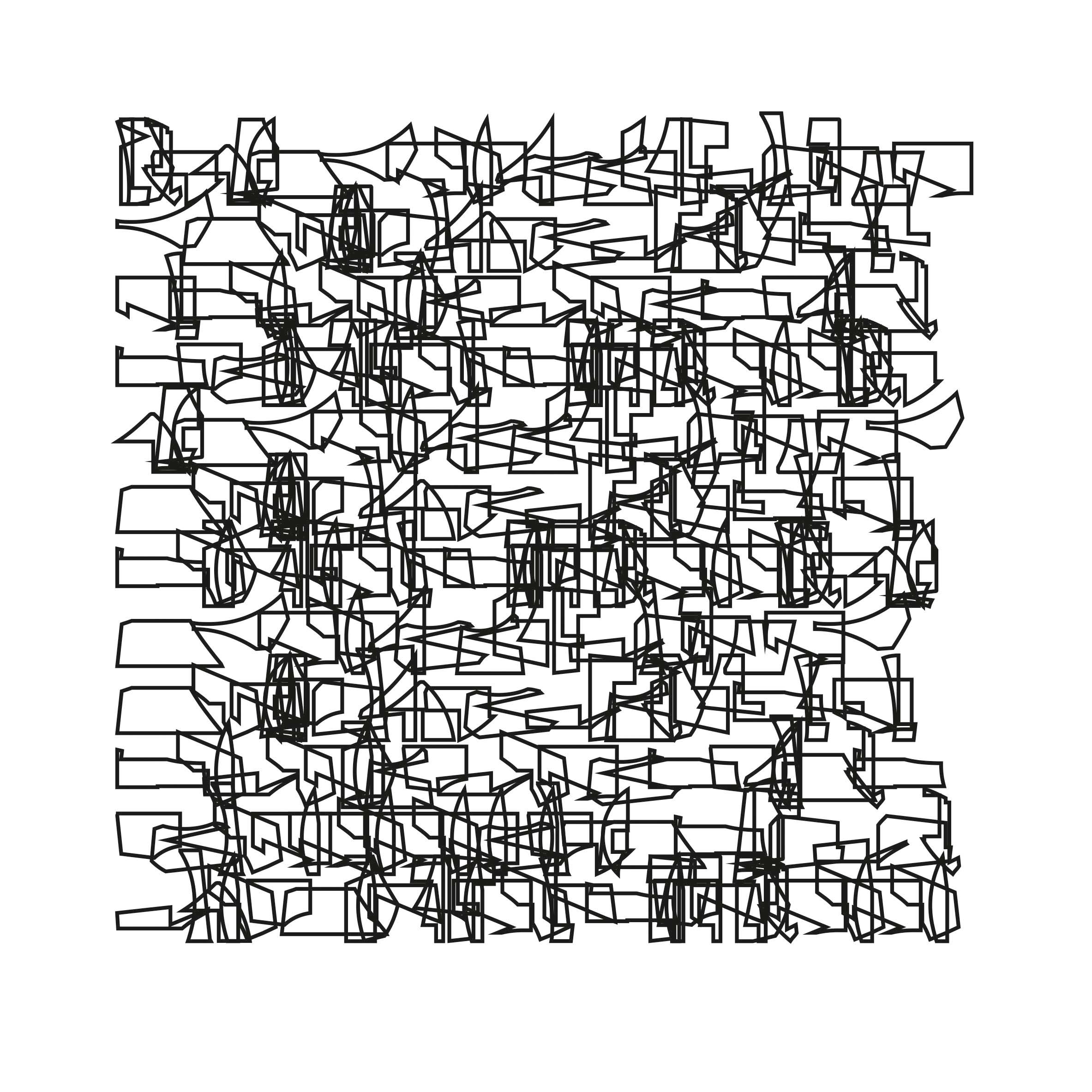
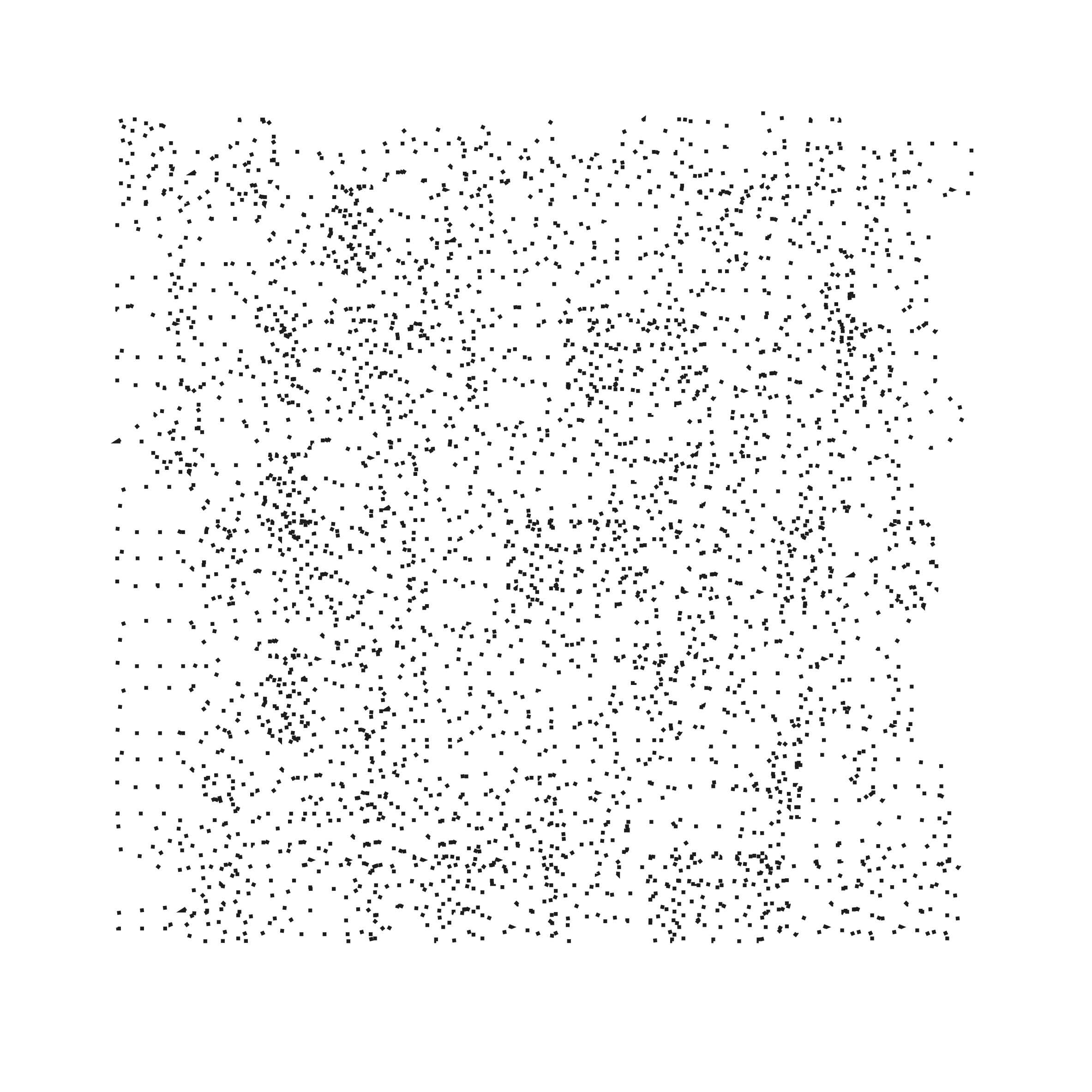
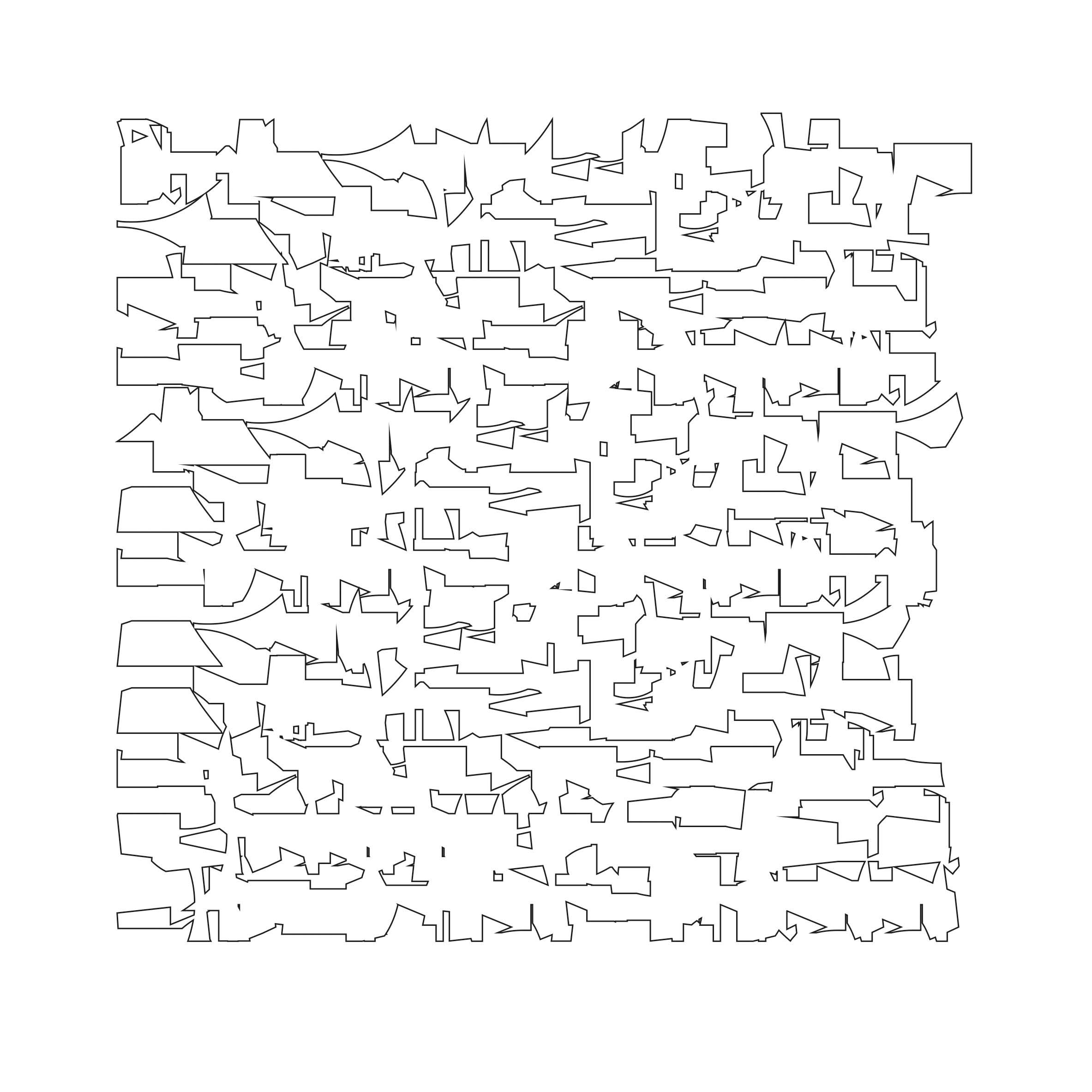
A text when stripped off from all its meaning, where the hold of signification and familiarity over text loosens, then it becomes an agglomeration of forms with no readability. One can think of it as a suprematist affective realm of non-objective exploration or as some meaningless and useless marks and stains like any other abstract painting.
Link for the Textspace2︎︎︎